Tourism boards try, they really do.
Fire up any one of their websites and you’re almost guaranteed to find a page bursting with Technicolor intensity, shouting out the names of the most standard attraction. There will be maps; suggestions for accommodations (that you absolutely should not ever take, or at least check the user reviews before you do); a completely confused looking schedule of the local public transport (usually very poorly translated); an irritatingly long page with a horrible write-up the place’s history; a list of popular activities along with the number of the state-sponsored tour-guides who’ll take you along; ways to get in and get out; notification of festivals, events and trade conventions… and they’ll offer you the whole package in three different languages too.
Understand, this isn’t just the country. Every state within a country will usually have its own tourism board. And WITHIN those states, every city will have its own. Even townships and villages are getting in on the game now (though their efforts are really atrocious – with terrible web design and lousier formatting).
They want to sell. They really do. That’s the sad part. In their frantic and eager offering of information, the site is usually so jumbled up and unintuitive, that the average guy planning a vacation jumps out of the site as soon as he lands in. – it’s too chaotic to explore. The whole affair is like a series of unconnected dots that MIGHT form a pretty picture, but at the moment look like something a baby scratched out.
So how do we go about connecting those dots?
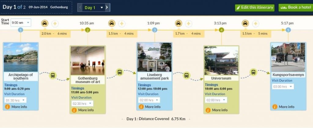
Well, in case you haven’t heard, there’s a new kind of toy making round on the Internet; it’s call the trip itinerary planner. The idea is that the user inputs the preferred destination and the preferred dates and sits back. The itinerary planner will then, using a smart algorithm, work out every conceivable bit of logistical information that might be needed to make the trip a success. Numbers are crunched, options are provided and chosen, accommodation and travel tickets are booked, and the trip is ready.
Now that’s called fast-food travel planning. How fast you ask? Ahem, perhaps 10 – 15 minutes or so. Another five minutes for every extra city you might want to visit, but certainly not longer than that.
These itinerary planners are usually web-apps with a massive database of destinations and itineraries… so massive that planning can become a bit unwieldy. But you know what’s perfectly suited to having it’s own itinerary planner?
That’s right – tourism boards. Here are the reason the revolution of itinerary planners needs to catch on at the government level:-
- Private Itinerary Planners only want to sell the good stuff. They skim the top attractions and tourist traps because they need their apps to look fun and exciting. A lot of the good stuff in a place gets missed out on this way; little and precious hidey-holes that all the locals know about but all the visitors are clueless about.
- The economic advantages are enormous. By including the lesser known, suffering and disadvantaged attractions into a itinerary, and maybe even feature them prominently, tourism boards can drive tourist economy where it’s needed.
- It’s not just the attractions that’ll get a boost in income; itinerary planners almost necessarily must include hotel booking options – without it, a trip plan becomes next to impossible. By listing all possible accommodation options in place, the hospitality industry itself gets a big boost.
- An itinerary planner with an optimizer function built in can fully utilize the tonnes of in-depth information that a tourism-board sponsored website already has. The problems of the sites are usually that they’re disorganized, not that they lack information. This is actually a far better itinerary service than most would be able to provide.
- Having an itinerary planner will force the tourism boards to streamline their websites into something more usable and with singular purpose; it’ll trim the fat. Forget maintenance costs – this will make the websites a lot more user friendly. The bounce rate is bound to fall.
While this isn’t a revolution that we can expect to kick off immediately, its almost inconceivable that every tourist website wont adopt it in one form or another in the future. Everybody wins in the itinerary planner scenario. And guess what, the future is here.
Author Bio: Geneva Ali works for TripHobo Trip Planner . She can be reached at geneva.a@joguru.com. Geneva is quite passionate about travel and all that is involved.
If you would like to submit a guest post on food, wine or travel to Where and What in the World, I would be happy to feature your travel experience , drink, special wine tasting, or family or simply delicious recipe. If you go to submission tab, you will see how to submit, as well as have the opportunity of telling me if you would like to would like to be a regular contributor. When uploading a file for submission, you are also able to upload jpgs. Please feel free to put a last paragraph about you and a link to your profile. No html please. You can also include a head shot.


